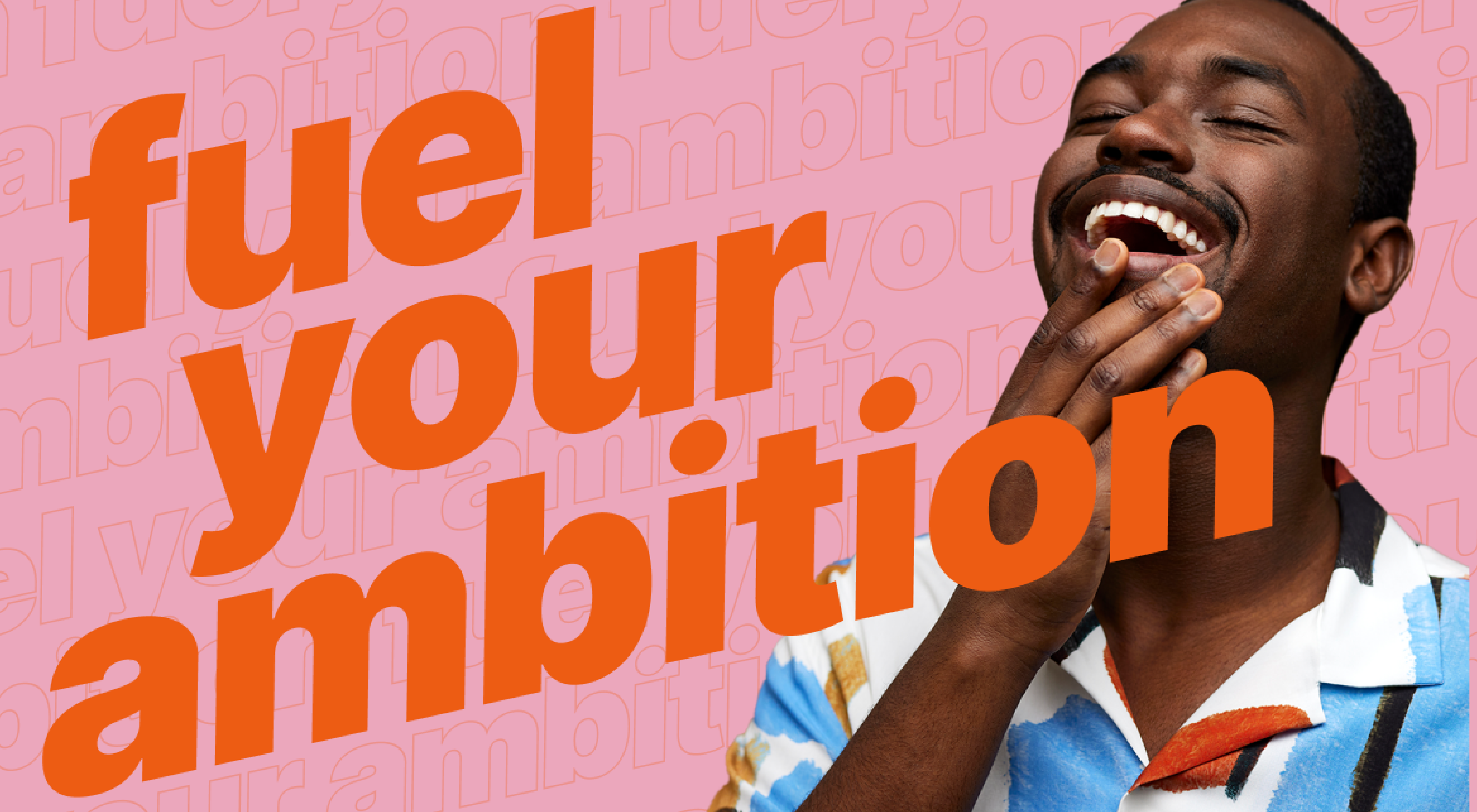
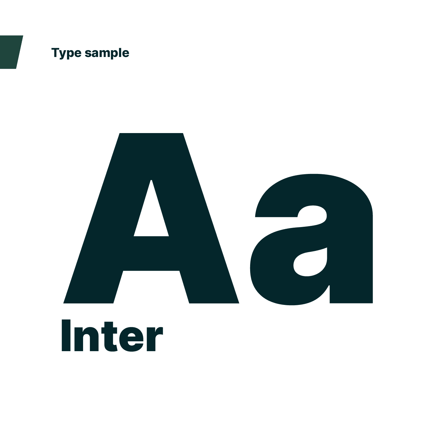
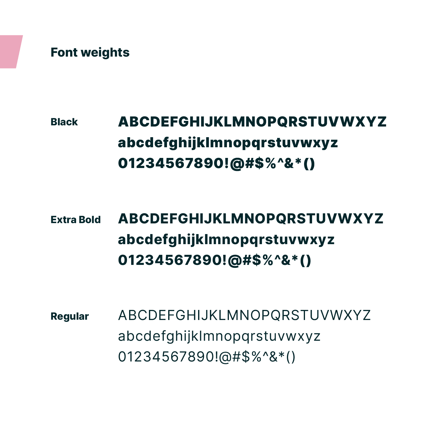
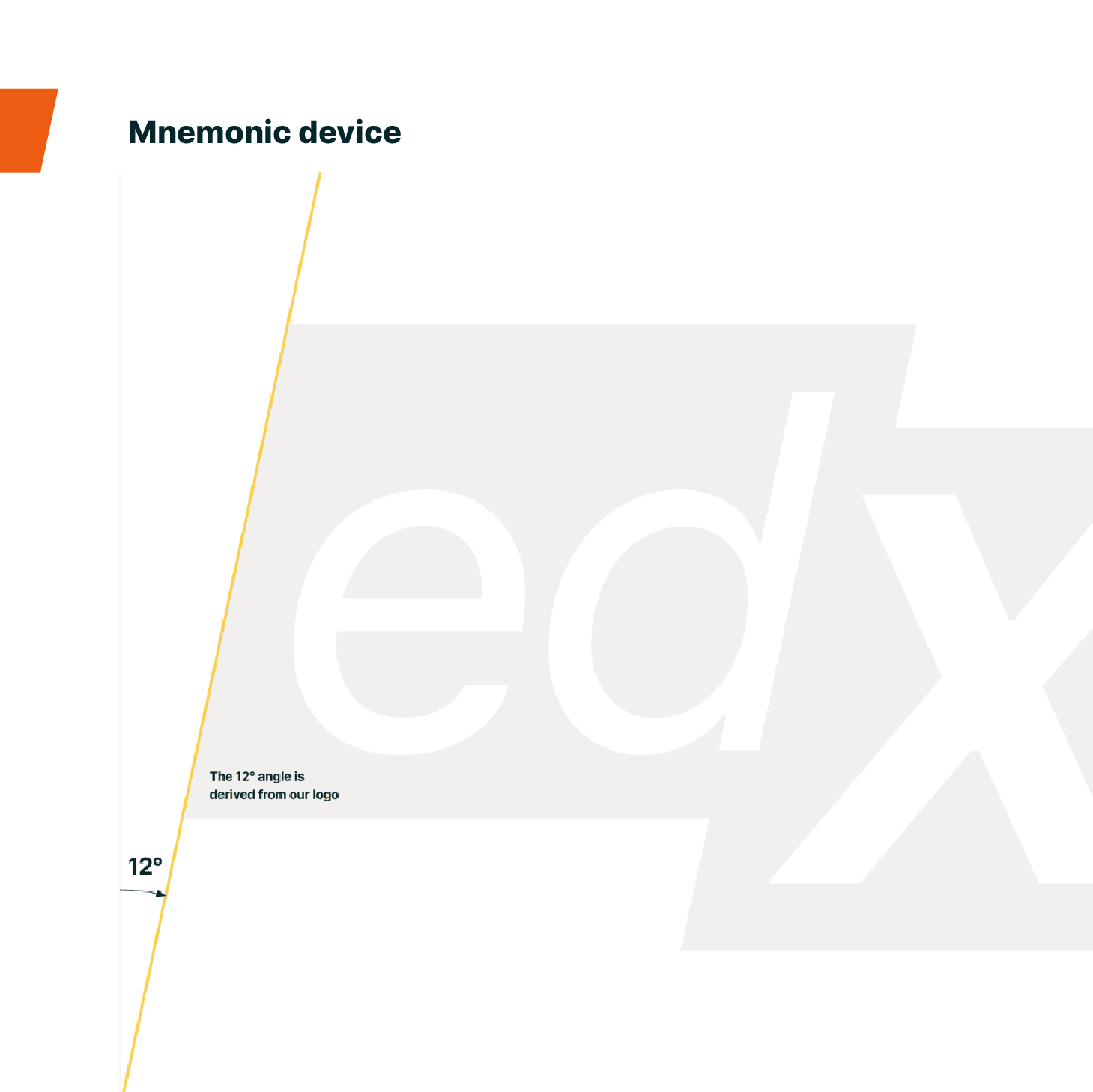
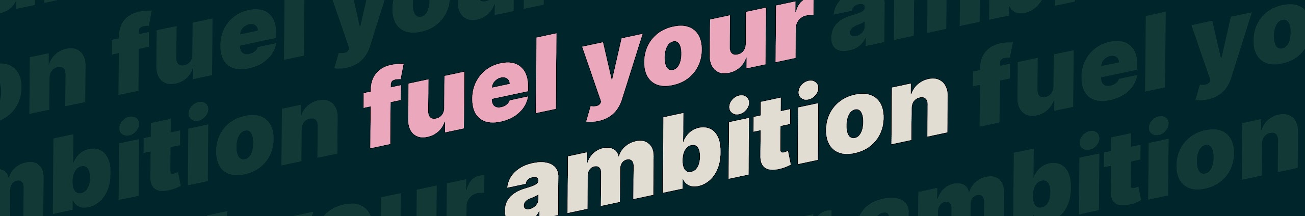
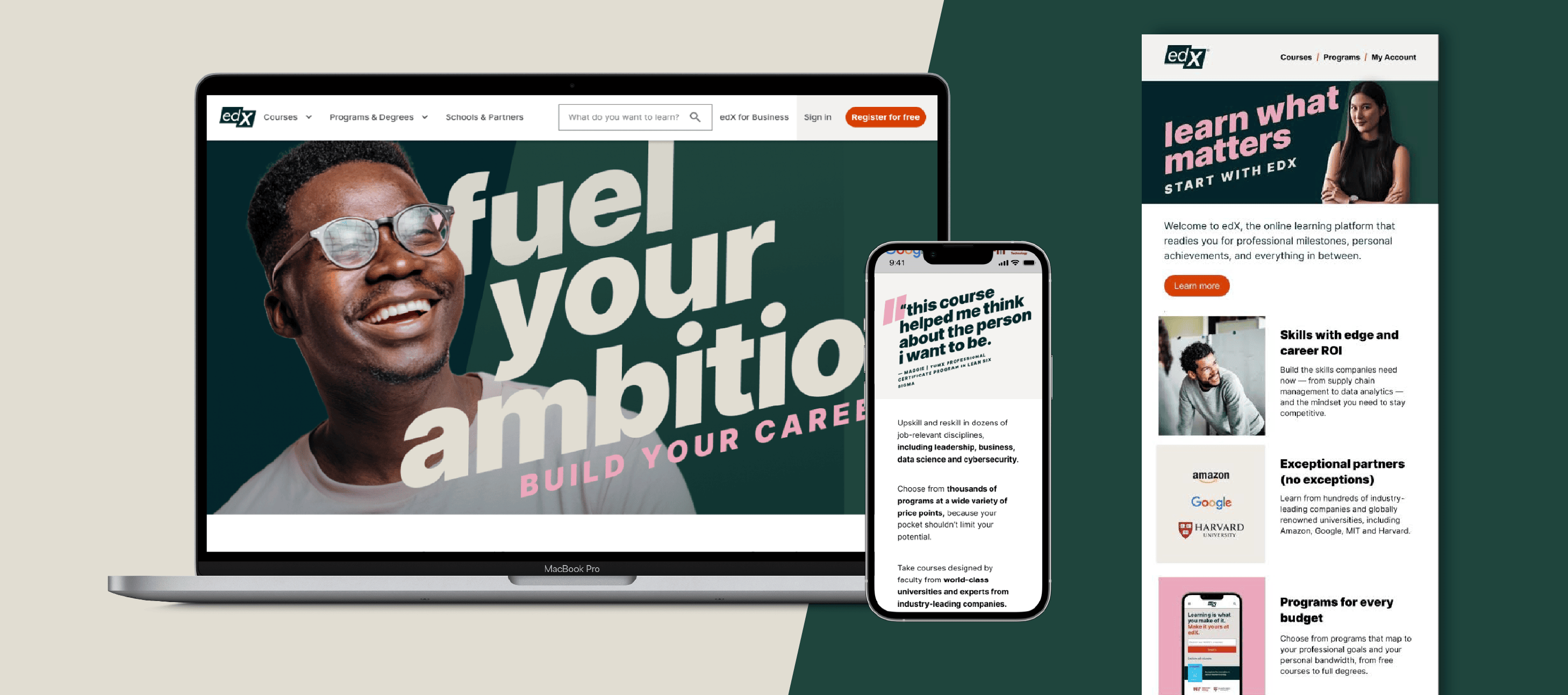
The edX corporate identity consists of a font system that is bold to reflect the dynamic “fuel your ambition” positioning, contrary to more traditional legacy fonts used by our University Partners, our approach for the corporate brand is less institutional, and more personable, speaking more relatable to consumers. Original inspiration made comparison between the ambition of an athlete and the striving of a learner, which led us to keep the forward motion of the inherited 12 degree mnemonic showcased on legacy assets pre-rebrand at the bottom of this page. We translated this visual device into an impactful heading style. We shifted the brand from the inherited masculine color palette and incorporated a more neutral palette that appeals to both male and female audiences.
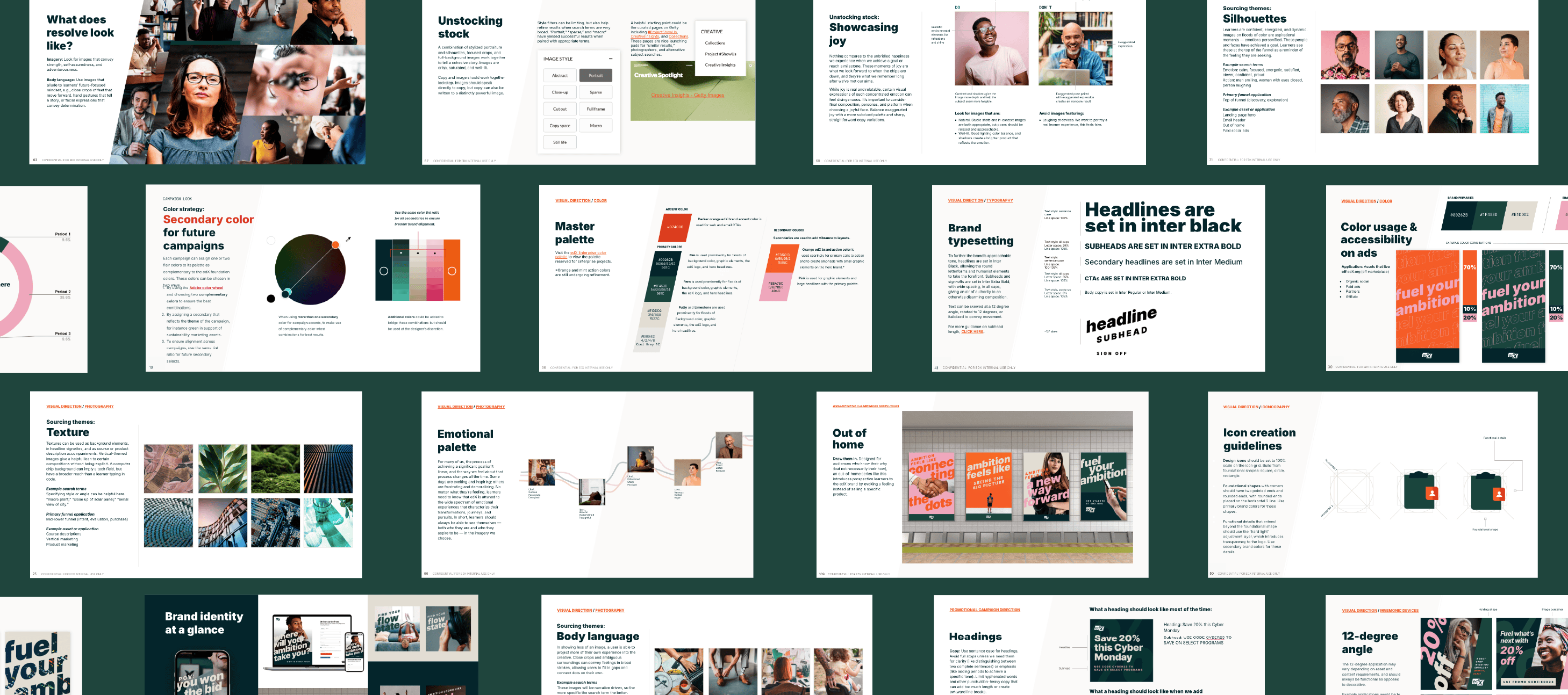
We translated the full brand evolution into a 158 page corporate brand guide, providing clear specifications to help creatives, marketers, and other stakeholders produce assets that are cohesive across departments. Among key sections, information includes brand architecture, positioning, value props, target audience information, University Partner relationship rules, and fully expanded written and creative direction.
edX photography, humanises the brand by focusing on people before products. Capturing learners; wants, needs, fears, and challenges in an authentic way, in order to make them feel seen , secure and excited about edX products.

Corporate brand campaigns
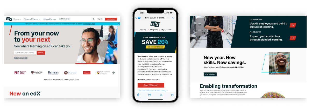
We created a specific direction for discounting and promotion campaign brand applications, with content that prioritises conversion focusing on driving registrations, enrolments, and other revenue-generating actions.

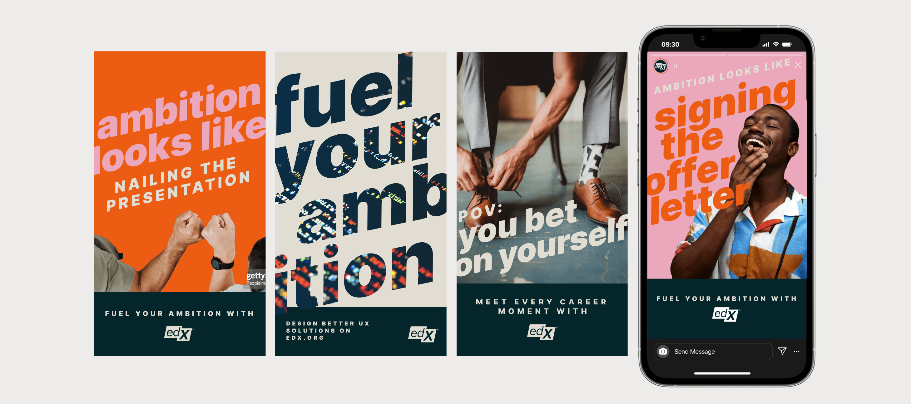
We also created a specific approach for awareness campaign brand applications, with a deeper focus on storytelling with messaging that speaks to the high level wants, and needs of consumers. Relatable to top of funnel demographics, targeting the segment of the market that is not yet familiear with edX, with the purpose of making an emotional connection, and building brand trust.
Old brand direction
For comparison, see below the old edX brand legacy direction. Before the above brand evolution, edX led with a masculine colour palette and angular fonts, and the messaging was primarily product focused.