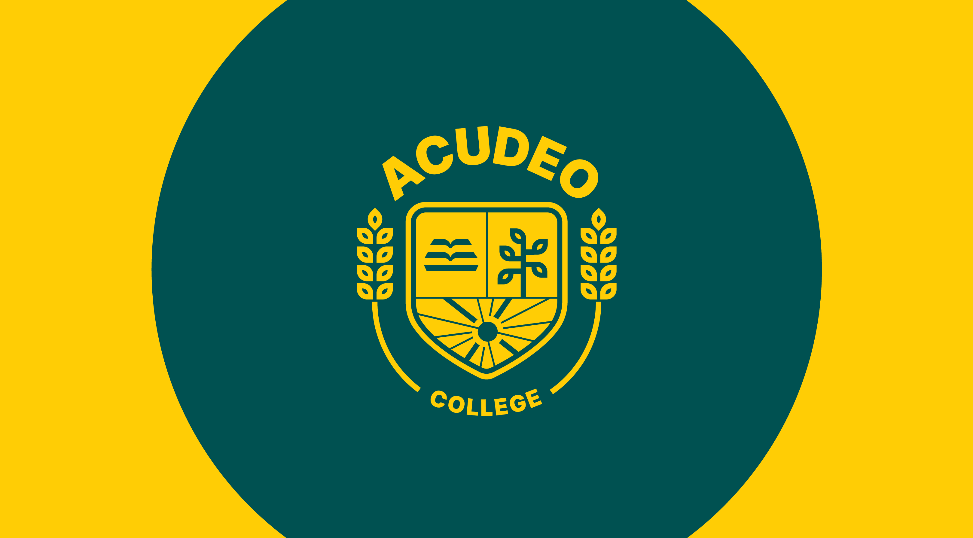
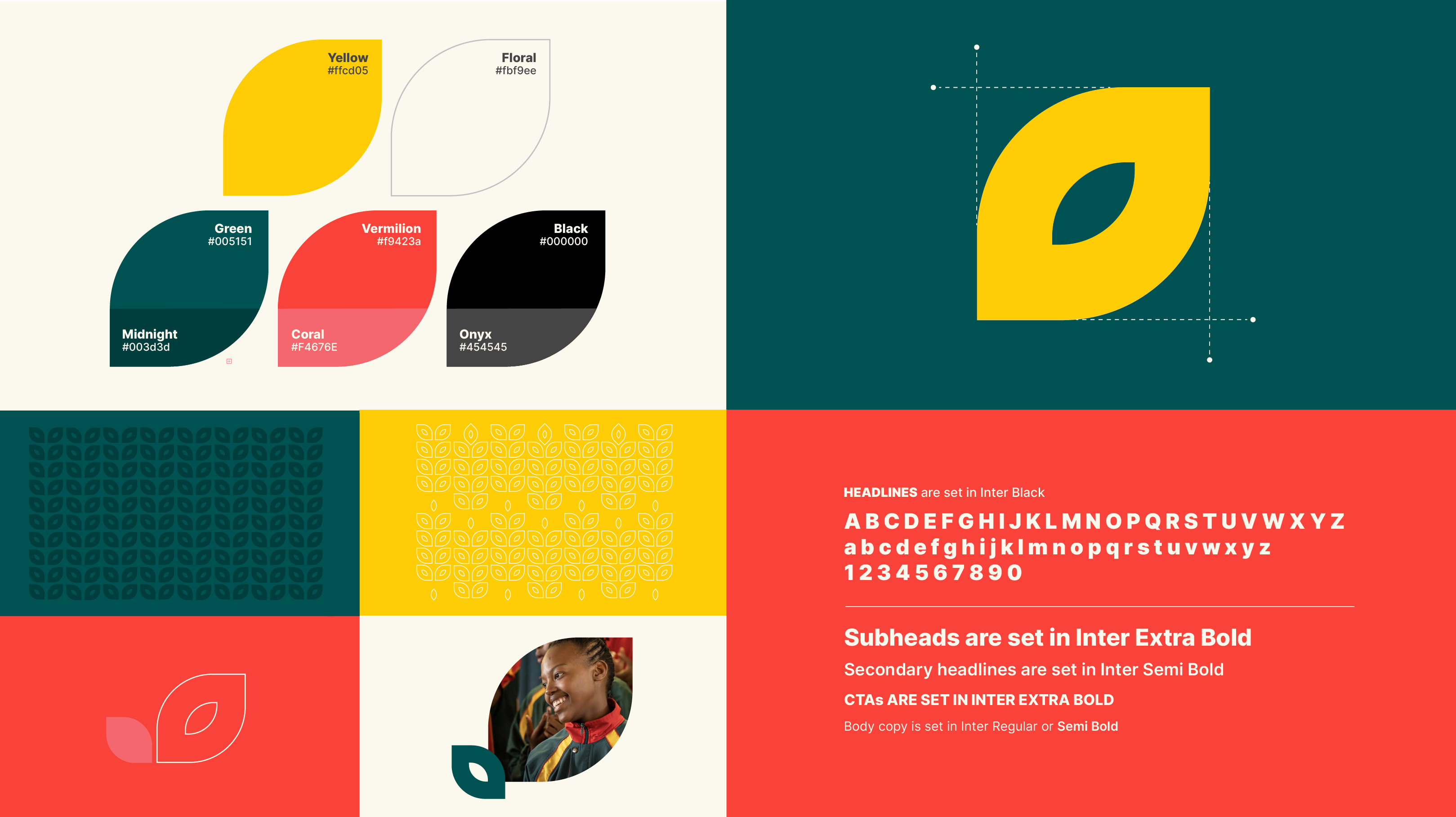
The ACUDEO visual system consists of a logo embodying different elements representative of the new brand positioning. The font system has been modernised to sans-serif from the legacy serif of the old brand look that can be viewed at the bottom of this page. The bold color palette of the old brand was retained, but tints slightly adjusted for a more premium look. The brand mnemonic is a leaf, from the tree and the wheat icons in the logo, as the primary signifier representing growth and fruitfulness, and is translated in expressive ways across the various brand roll outs to create a cohesive look.
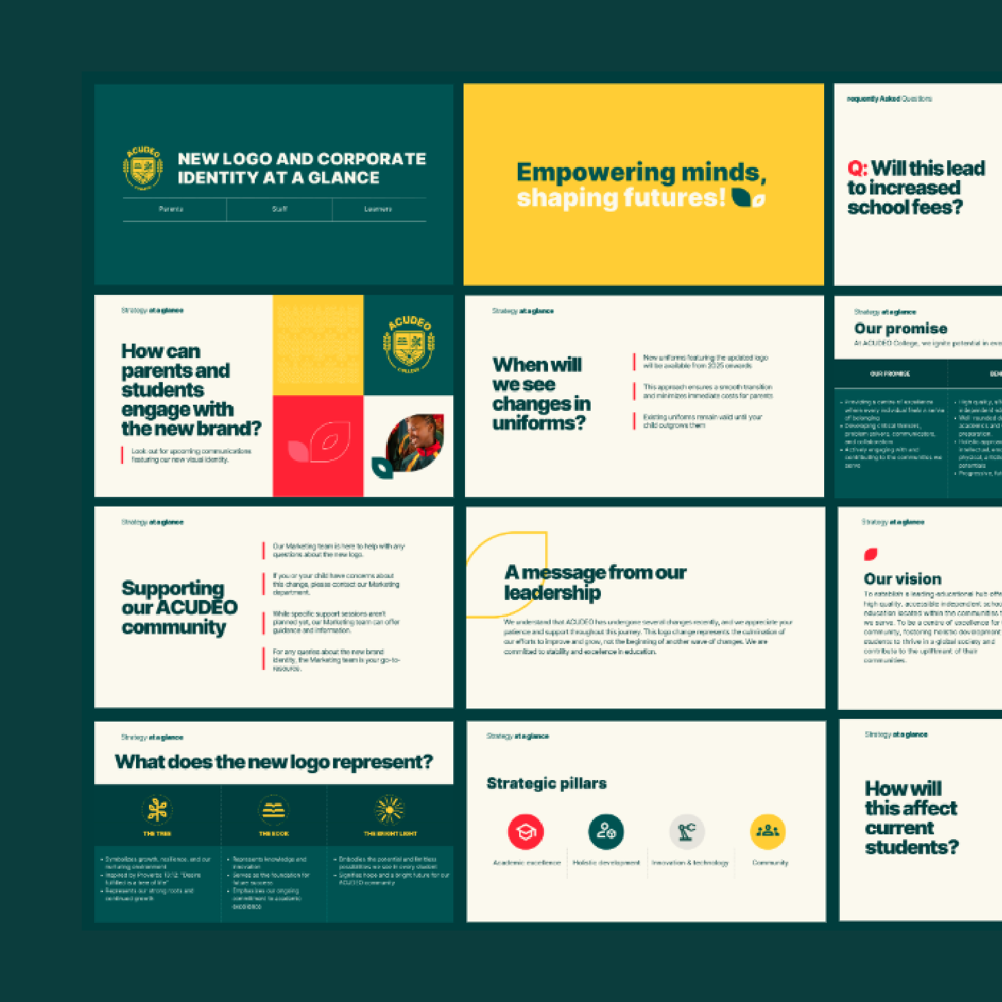
This brand evolution was translated into a corporate brand guide, providing clear specifications to help creatives, marketers, and other stakeholders produce assets that are cohesive across departments. Among key sections, information includes the new brand identity, as well as ready-to-use brand templates.
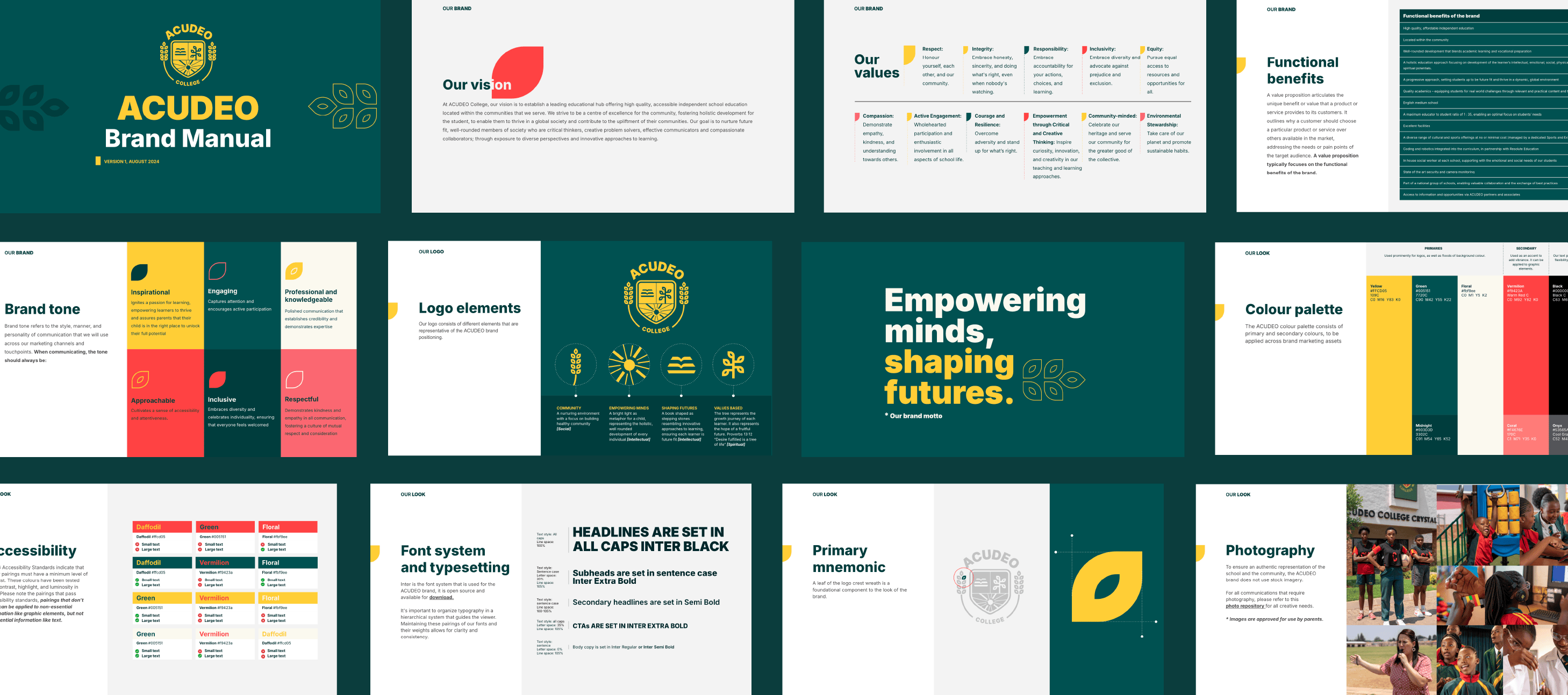
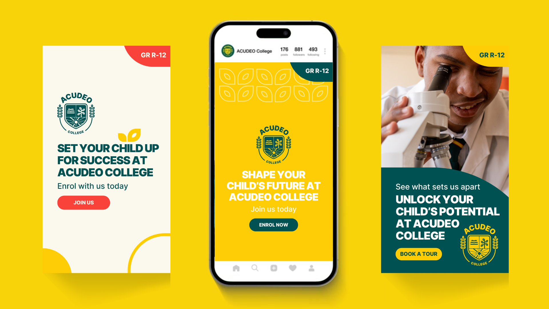
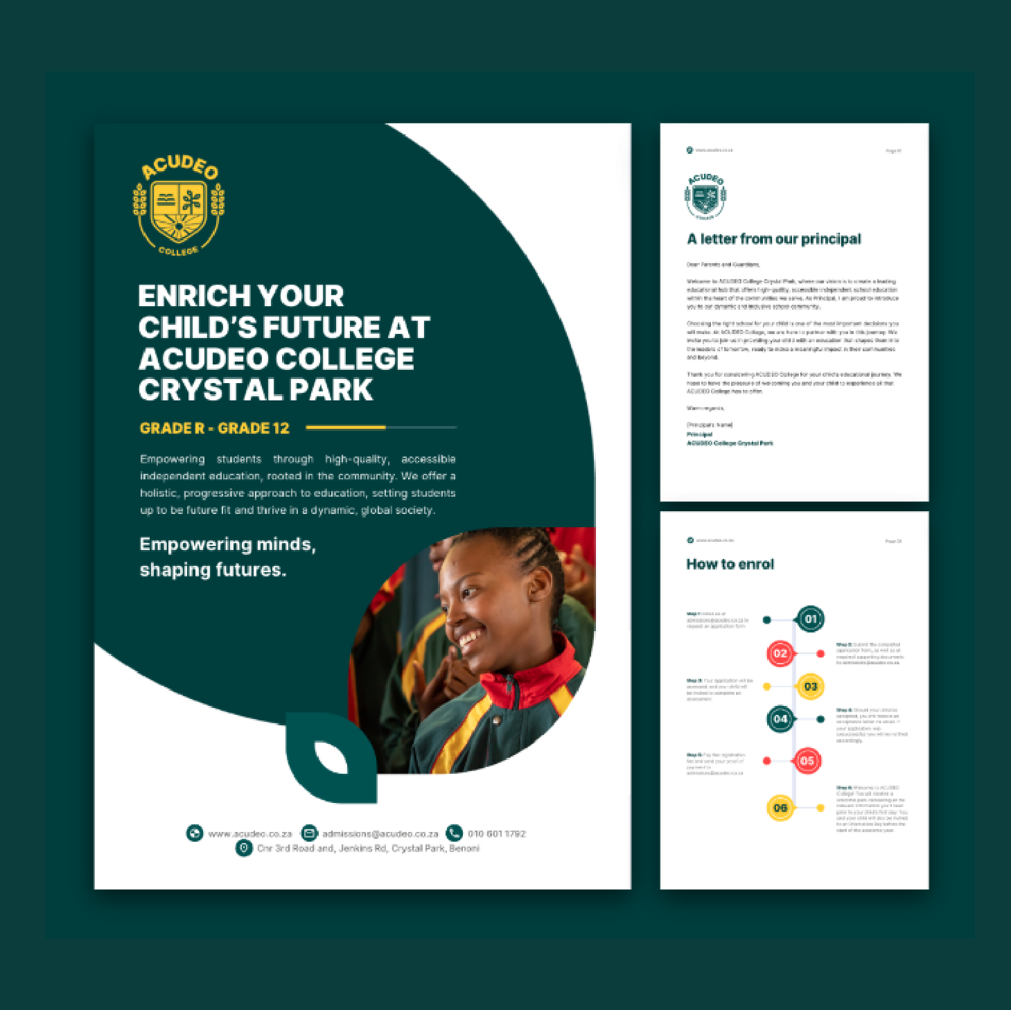
Brand templates
Part of the rebrand included a series of ready-to-use brand templates that could be used across schools and teams for the various admin and sales purposes, including templates for social content, prospectus, slide decks, forms, etc.

Launch campaign
The launch campaign consisted of a introduction video to learners, parents, and funding partners, and shorts of the same video was released on social.
Old brand direction
For comparison, please see below the old ACUDEO brand legacy direction.