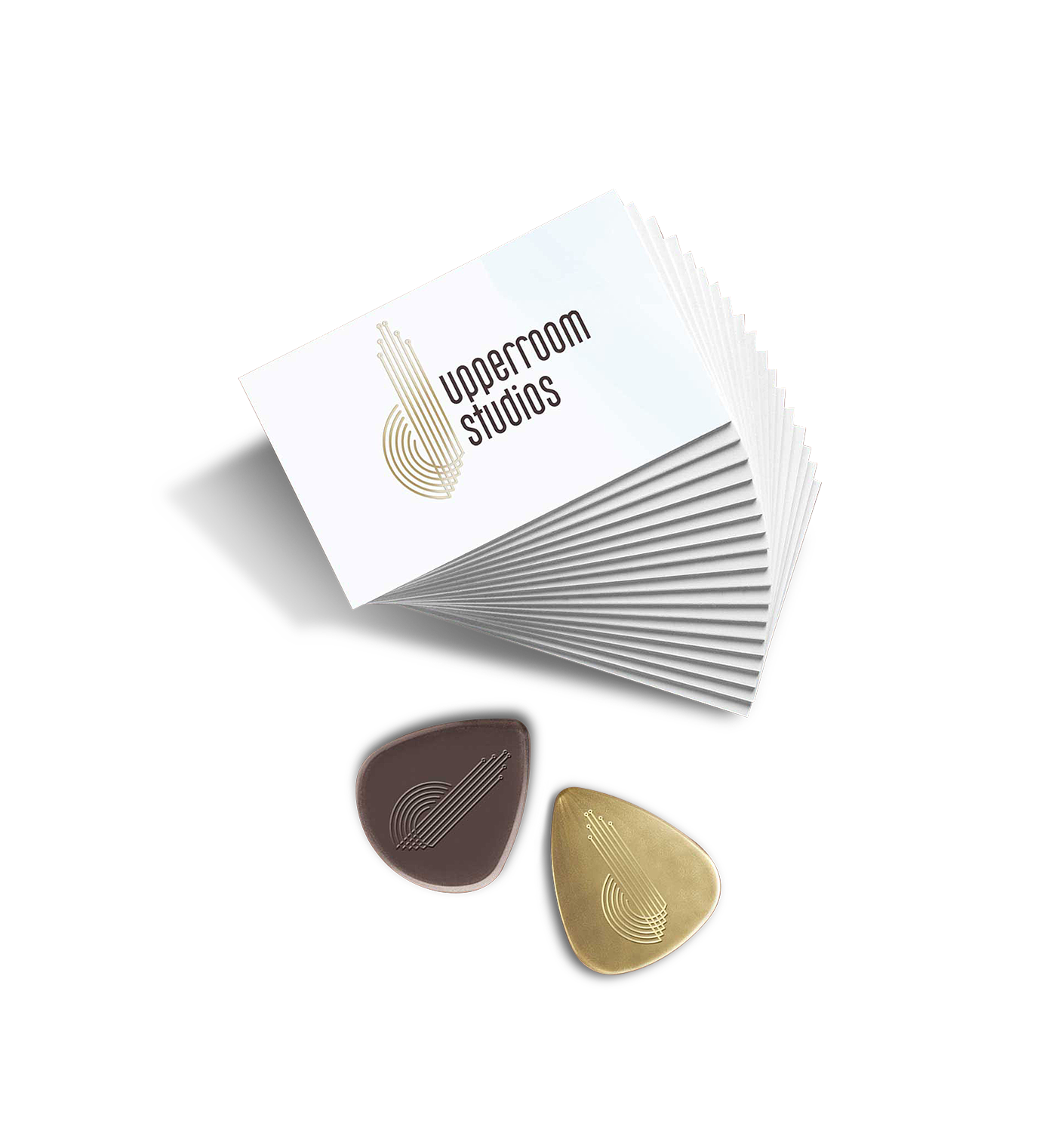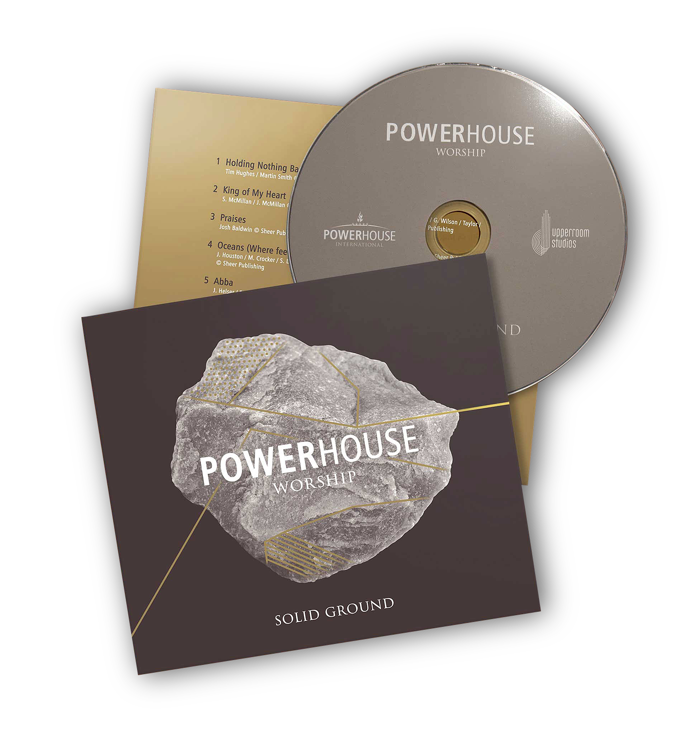

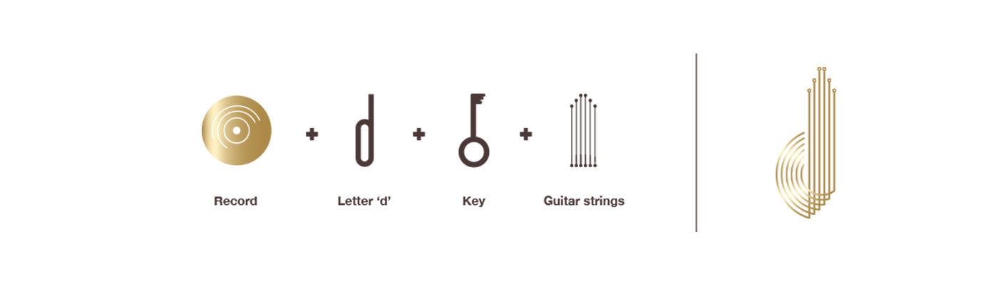
A production house requested a rebrand, that included a logo design for their new recording studio, as well as a CD design and packaging for their first album release. The logo is a combination of mnemonics that reflect the brand story including David’s ‘d’, a key, and the strings and mouth of a guitar. I opted for a brown and gold palette and suggested gold Pantone and gold foiling for a premium print finish.