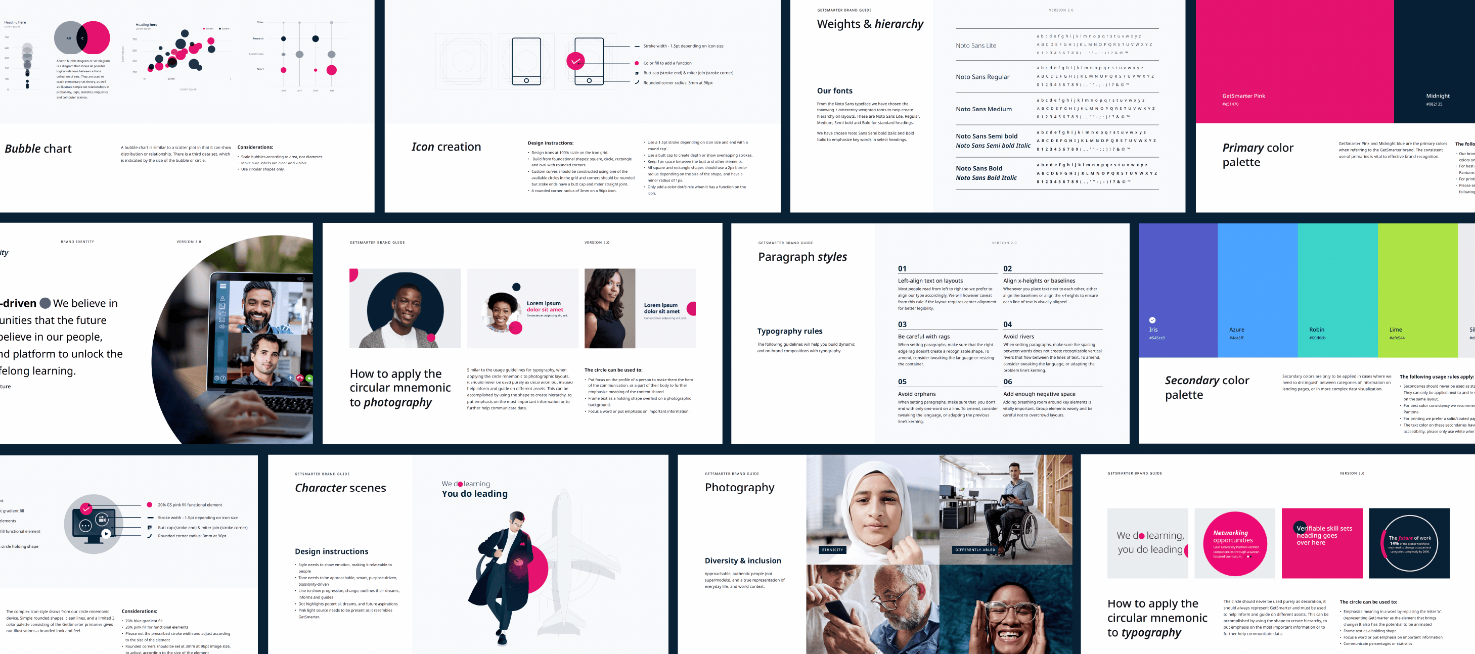
The GetSmarter brand guide provides clear specifications to help creatives, marketers, and other stakeholders produce assets that are cohesive across departments. Among key sections, information includes positioning, value props, target audience information, co-branding relationship rules, and fully expanded written and creative direction.
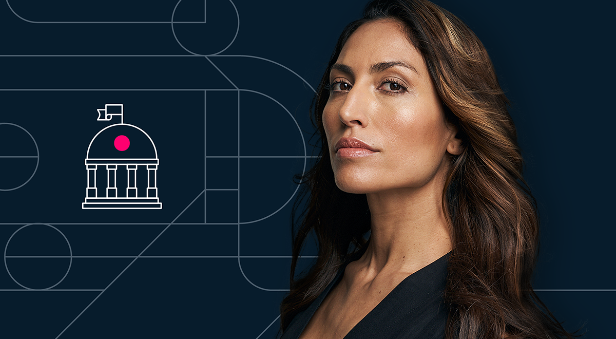
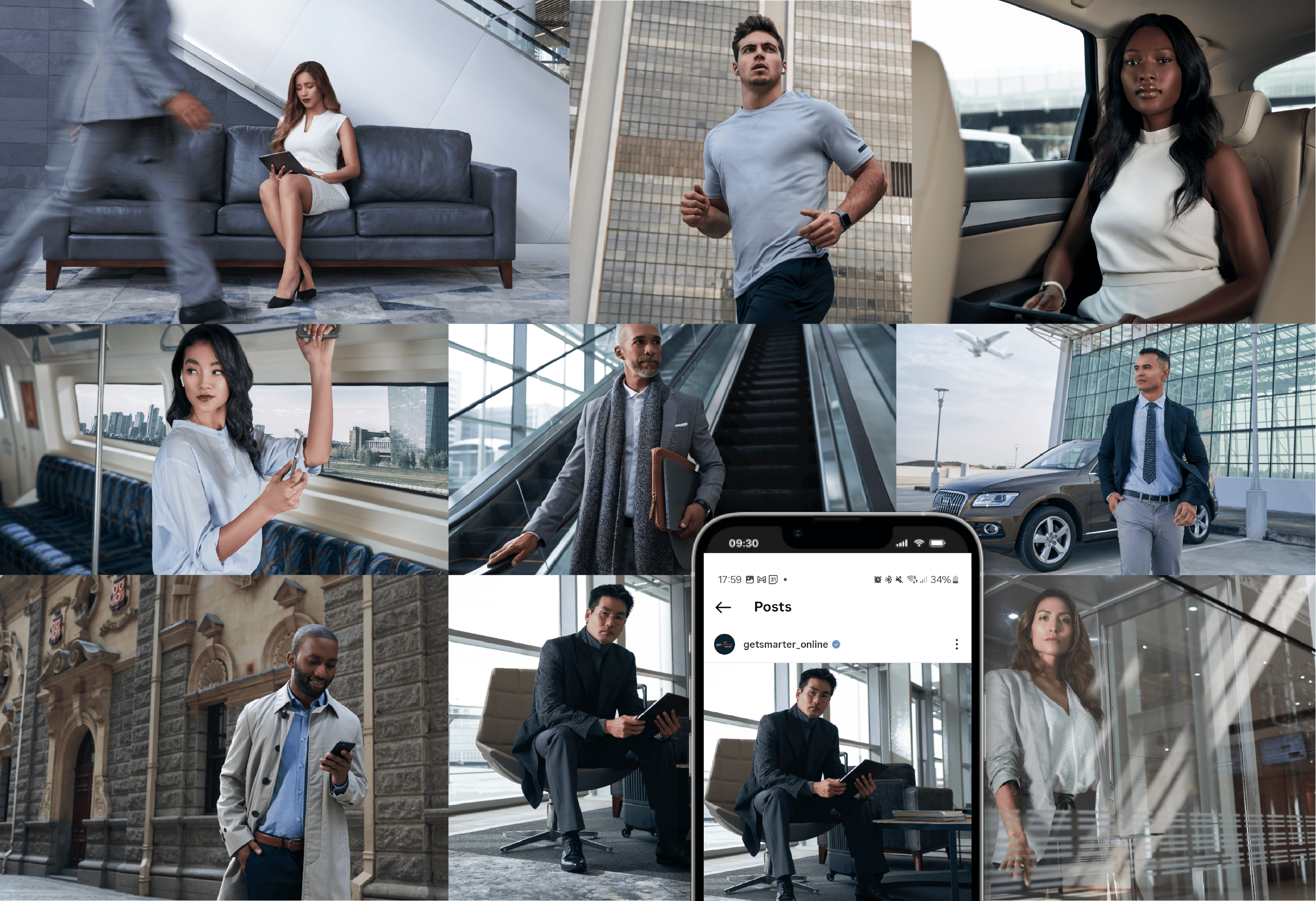
The rebrand included delivering a curated library of bespoke photography that captured the gravitas of GetSmarter’s prestigious university partners while resonating with the target audience personas. My responsibilities encompassed model, wardrobe and location selection, and creative direction on the shoot, and directing the roll out application on marketing assets.
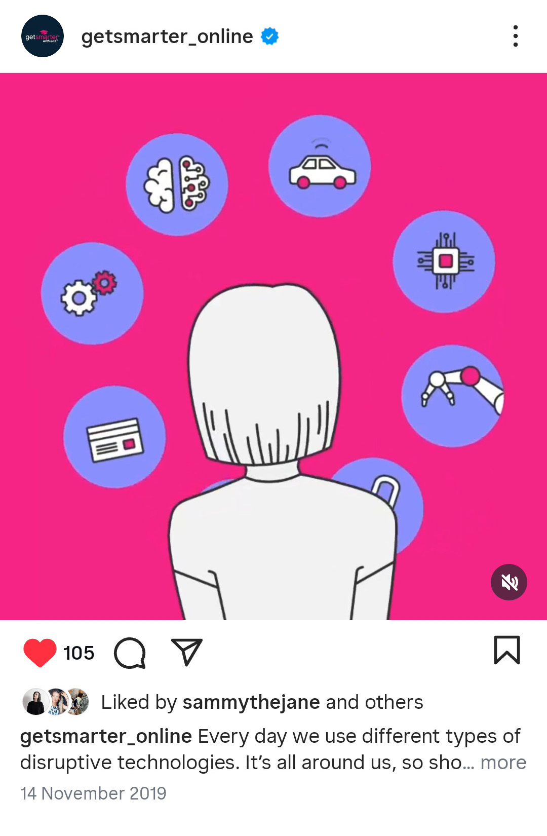
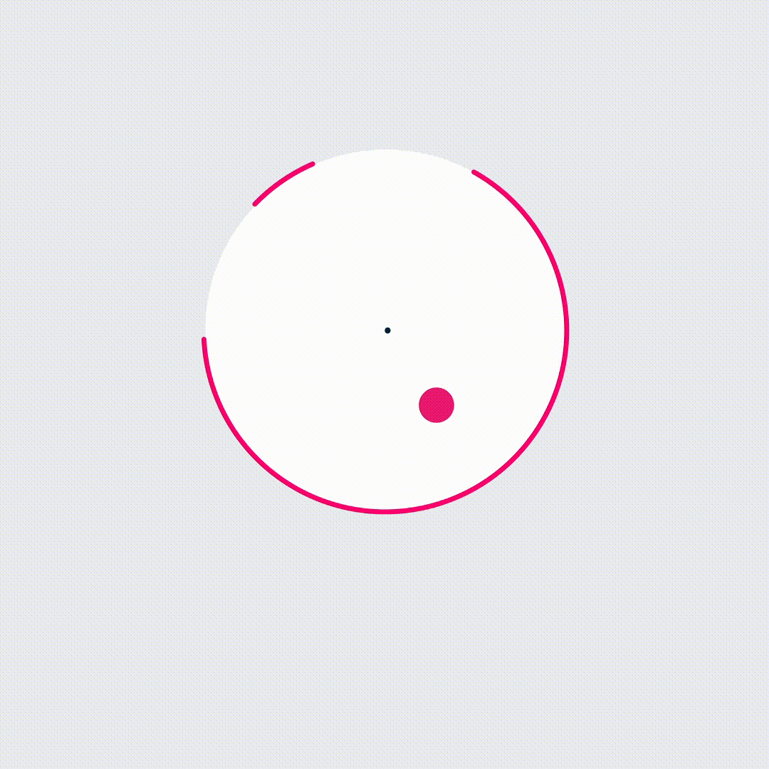
The GetSmarter visual system reflects the student’s “journey of lifelong learning”. Line elements serve as primary storytelling devices in the creation of graphics and icons, while solid shapes or circles symbolise the transformative impact off short courses in equipping learners with the skills and confidence to overcome any professional challenge.


Corporate brand campaigns
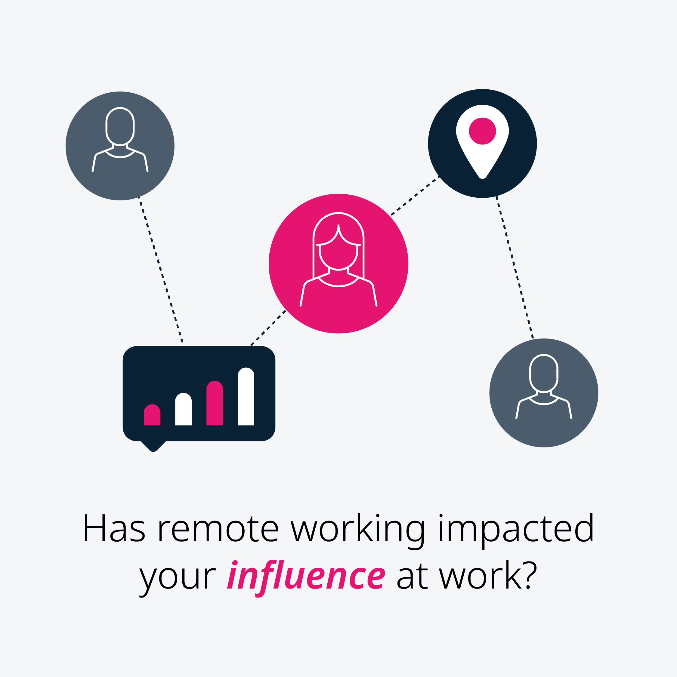
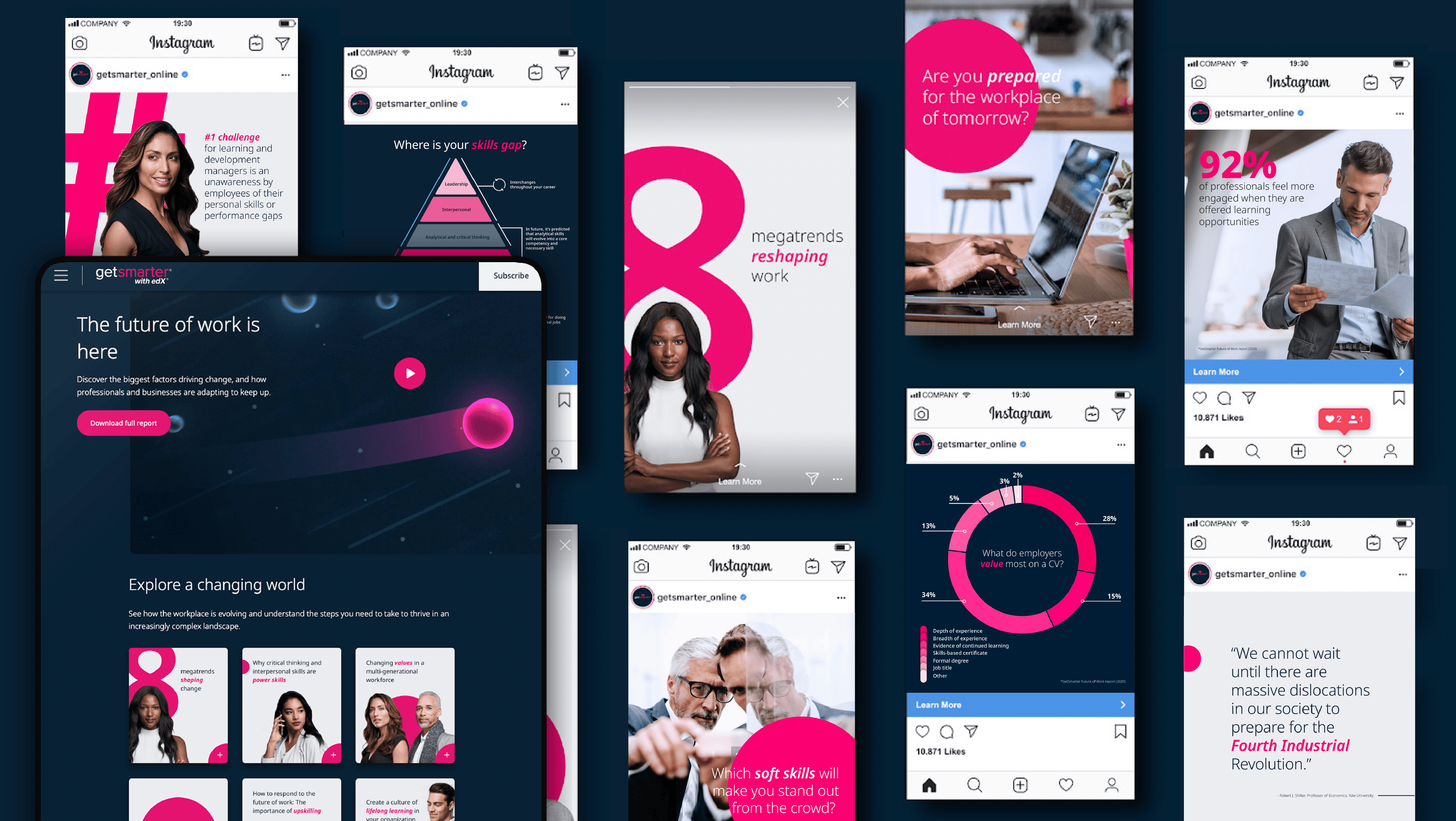
For this brand, we developed a range of organic campaigns designed to position GetSmarter, not merely as a short course provider, but as a credible thought leader within the education industry. One such campaign, themed The Future of Work, included a white paper report, video, and a supporting social media campaign.
Old brand direction
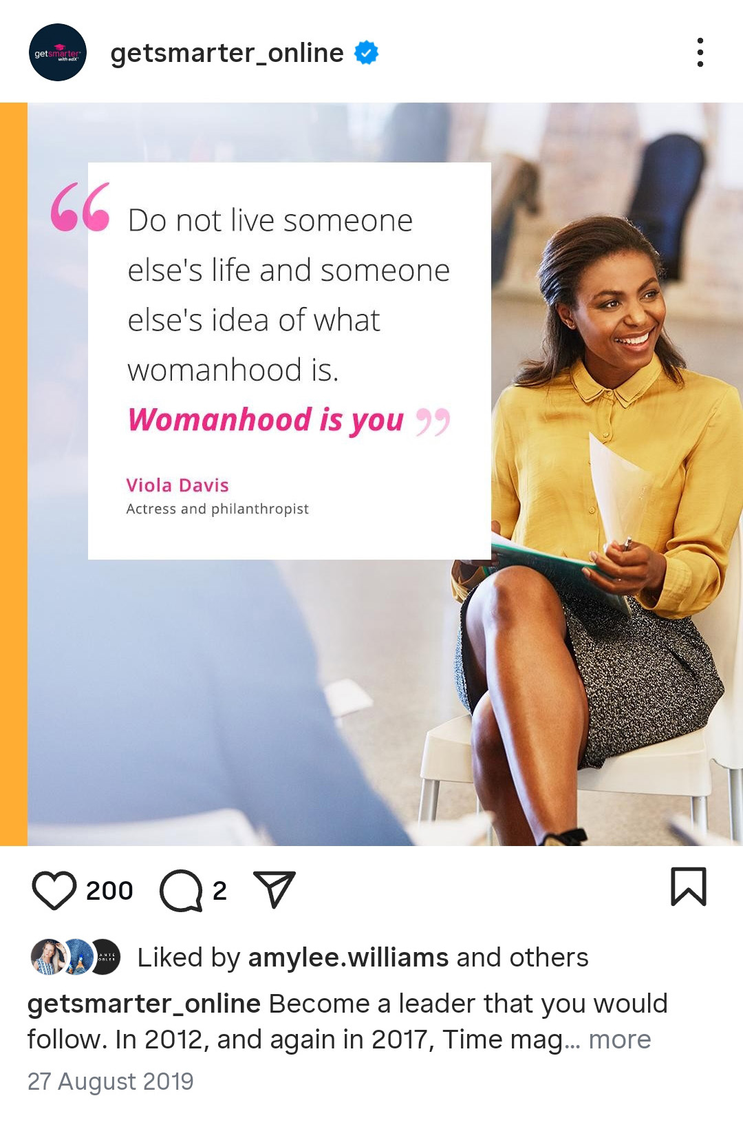
Before the above brand evolution, GetSmarter had an inconsistent brand presence across platforms and asset roll outs. Here is the old GetSmarter brand legacy direction.