The Nando’s brand story.
Inspired by the rich heritage of the use of Peri-Peri in its land of origin, Mozambique, the well known story of how this amazing spice came to be hails from its humble beginnings, the African Bird’s Eye Chilli.
The Nando’s brand story starts with 2 symbols which is its original inspiration and also its 2 favorite ingredients, Peri Peri spice, and a chicken. Inspired by the rich heritage of the use of Peri-Peri in its land of origin, Mozambique, the well known story of how this amazing spice came to be hails from its humble beginnings, the African Bird’s Eye Chilli. Interesting fact, chilli’s are actually fruit, not vegetables. First discovered by Portuegese explorers who very quickly adopted it into their diets and carried down over centuries until it landed in the hands of two friends in a portuegese restaurant in 1987, and our culinary world changed forever.
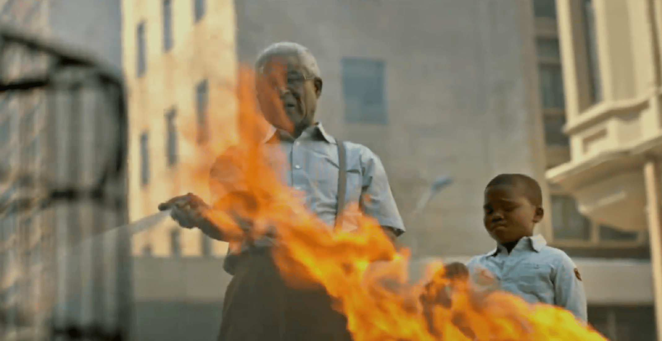
The 2 men inspired by this amazing ingredient and the chicken they were going to stuff it with stumbled on the legend of the lucky Barcelos cockerel who’s crow saved a pilgrim’s life and uses it as a metaphorical blessing to all who grace the doors of Nando’s.
Tone of voice – The Nando’s tone of voice is as cocky as its logo, from the font to the writing style, there is nothing tame about it. Ballsy and bold, they make use of Semiotics to create hidden meanings in their ads and these are often playful, cheeky and have very definite African roots and Portugese influences to stay true to the brand story.
The brand vision, purpose, positioning and values are all linked into one very loose goal, and that is to bring people together through a shared love for Peri Peri around a Nando’s meal. Their approach to their early days slogan was “have fun and then make money”, still telling of the personality of the eatery.
The ‘Nando’s experience‘.
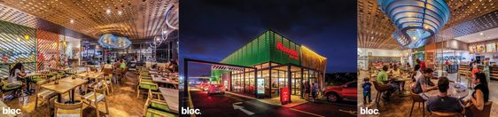
The brand’s mission is to give consumers the ‘Nando’s experience’ which refers to its unique personality, built around their coined concept of Afro-Portugues roots with local South African Art and design touches that vary from restaurant to restaurant. These influences make each restaurant truly diverse while still aiming to pull all franchises together to communicate one cohesive brand. An example of one of these outlets is in the Bluff Towers Shopping Center in South Africa, built by Bloc Architects.
Things get really exciting when we start looking at how the brand’s visual and verbal language is portrayed in their different brand identity elements. All parts were carefully considered.
The Nando’s logo and mnemonic system.
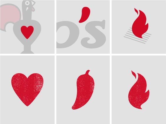
Starting with the logo which they call the Barcelos icon, named after the legend of their brand story, comprised of a visual system of hearts, and flames that is used all over their media.
Custom font.
Their font was hand-crafted by a South African sign writer, Marks Salimu and then digitised to be used across all marketing media as a font unique to Nando’s.
Color palette.
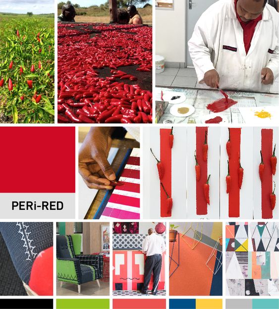
And then of course the infamous red brand color which they have appropriately named peri-red to suit their main ingredient.
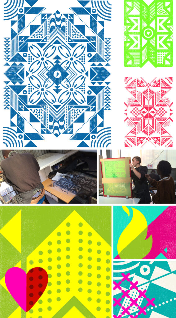
Patterns.
Taking the cue from the Mnemonic system in the logo Nando’s expanded on these by creating patterns made up of a combination of African and Portuguese icons to celebrate their heritage. These are also used on all kinds of interior elements as well as marketing material to further the brand image.